
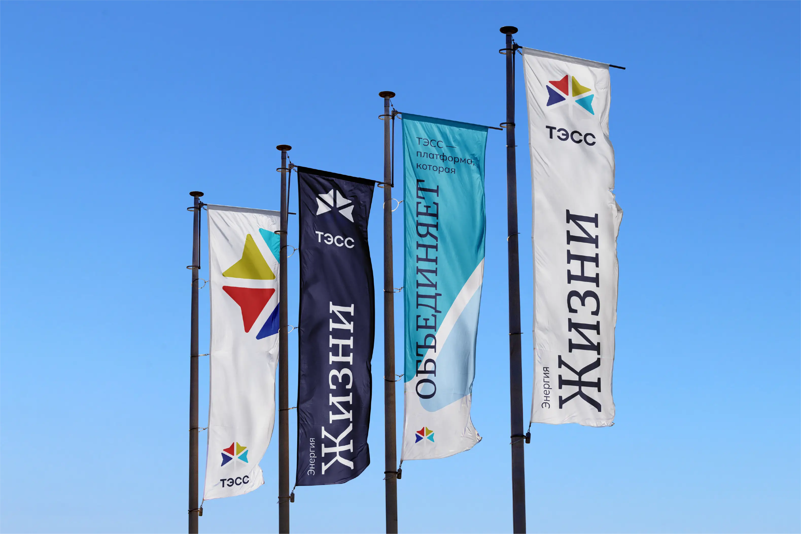


Tэcc
2024
energy and distribution
ТЄСС (or TESS) is an energy sector holding company, founded in 2004
in Siberia, Russia, providing services such as maintenance, energy
management, testing, reverse engineering, and electrical
installations.
In recent years, the company has been internationalizing,
consolidating international partnerships, and undergoing digital
transformation, investing in innovation and digital efficiency,
standing out in technical competitions.
team
Antonino Barbaro
[Creative Director]
me :) [Art Direction and Design]
background
With its recent expansion into the Far East market in 2019, and also
envisioning expanding into the Western market, TESS felt the need to
change its brand strategy along with its visual identity.
The company sought to position itself as modern, innovative, and
efficient, while still maintaining a restrained posture, given the
context in which it was operating.
challenge
The main challenge was the cultural disparity between both parties.
As a Brazilian, I had to understand with my colleague, Antonino, how
we could adjust the tone to mitigate communication noise.
Within this cultural issue, for example, it would be a weak point
for the company, if the brand used in its color usage system,
relationships that could refer to specific countries, due to the
moment Russia was in.
Additionally, creating a unified system for logo creation for
services and for different company branches was a challenge. Trying
to use colors in a way that they were combined safely, typographic
legibility and systematization for replication were key points for
the successful delivery.
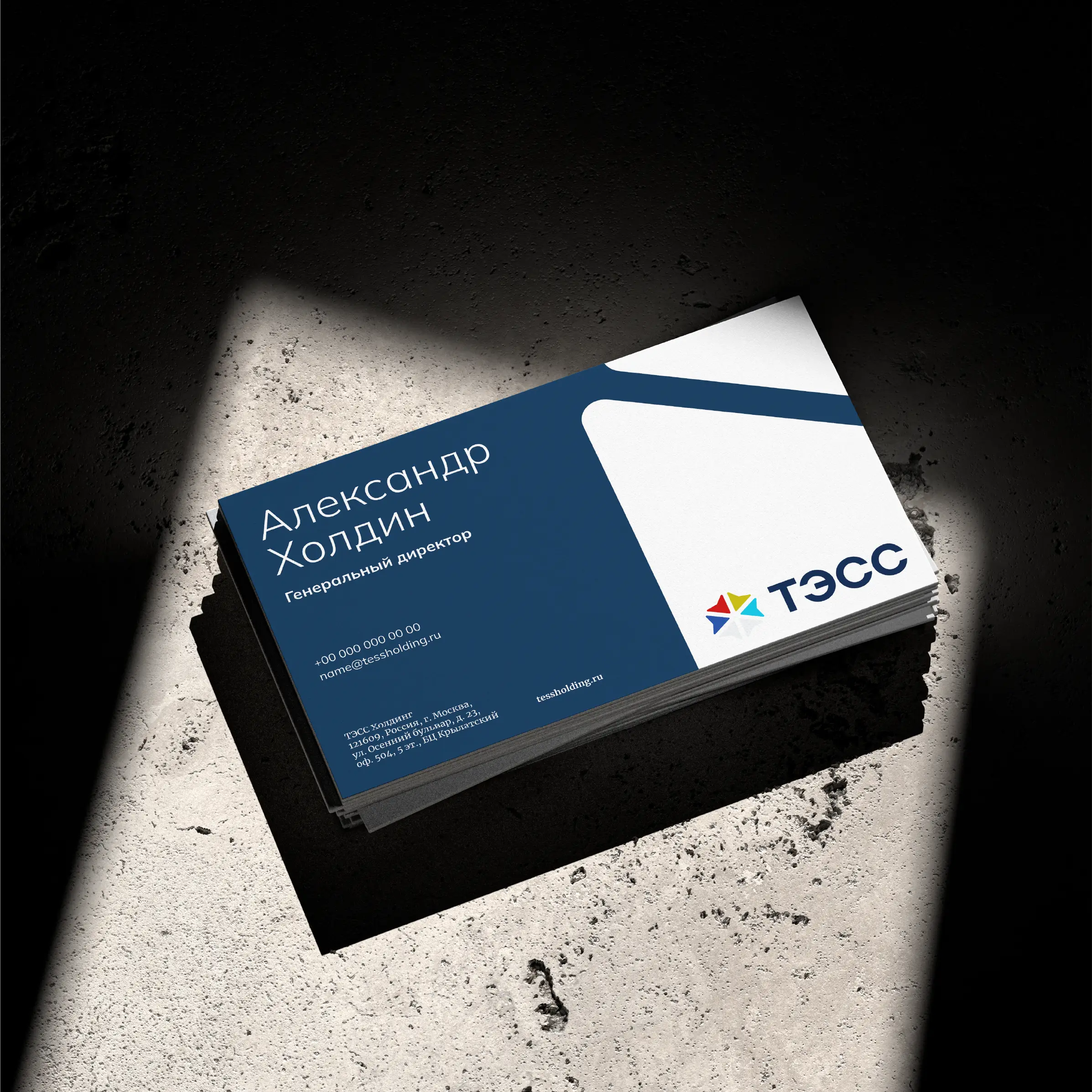
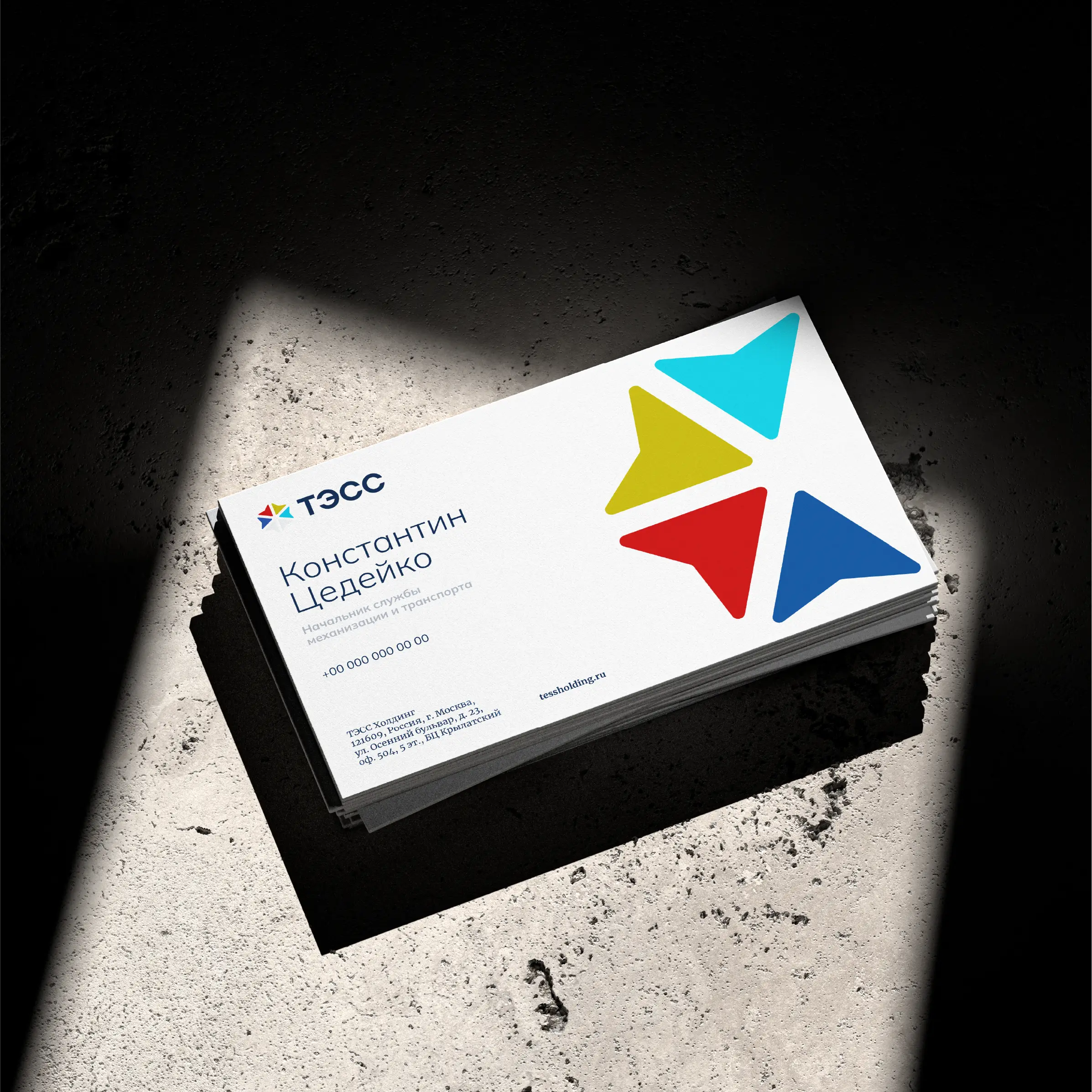
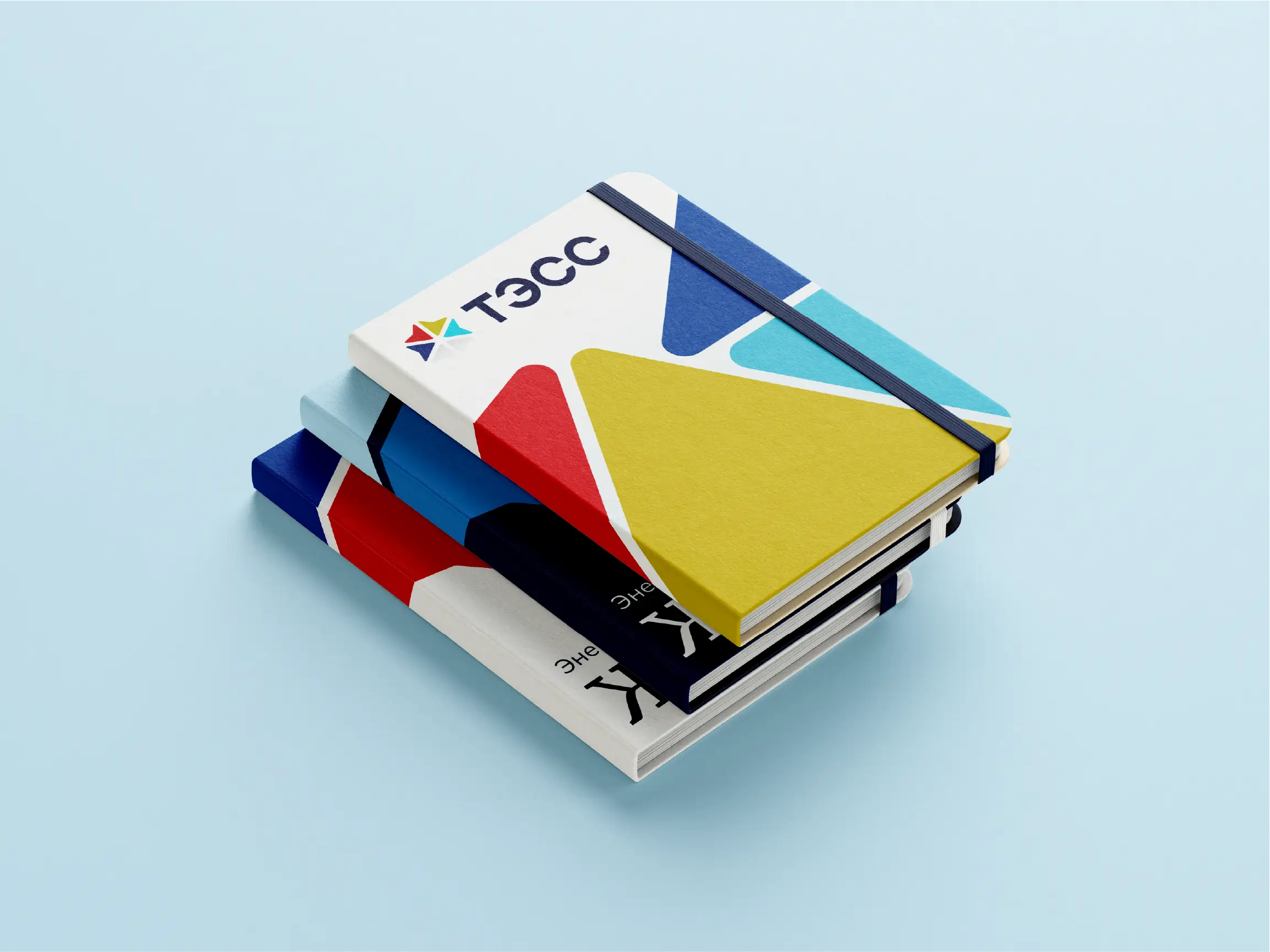
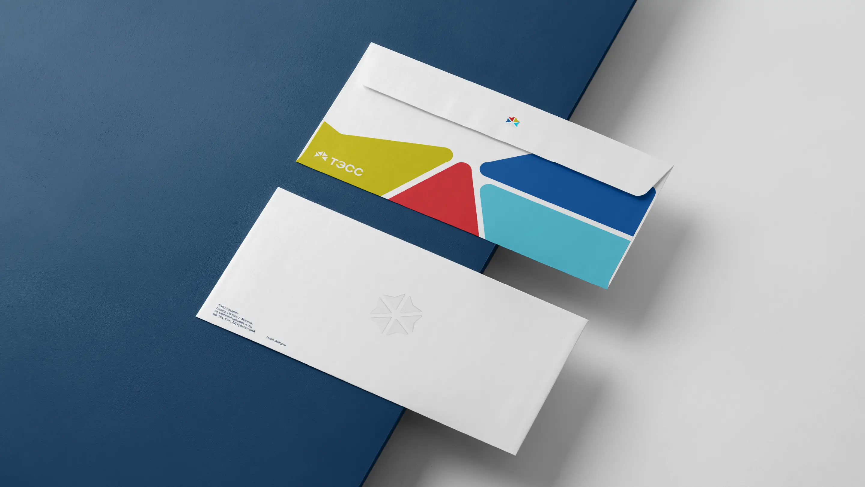
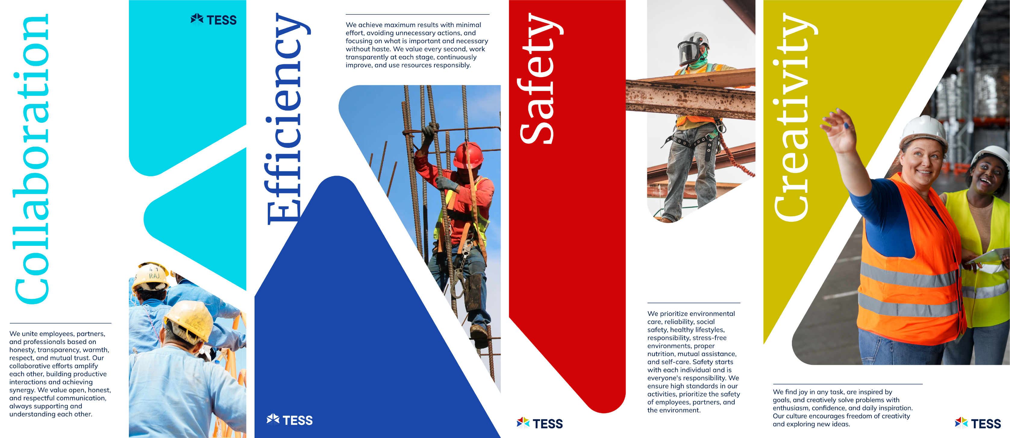
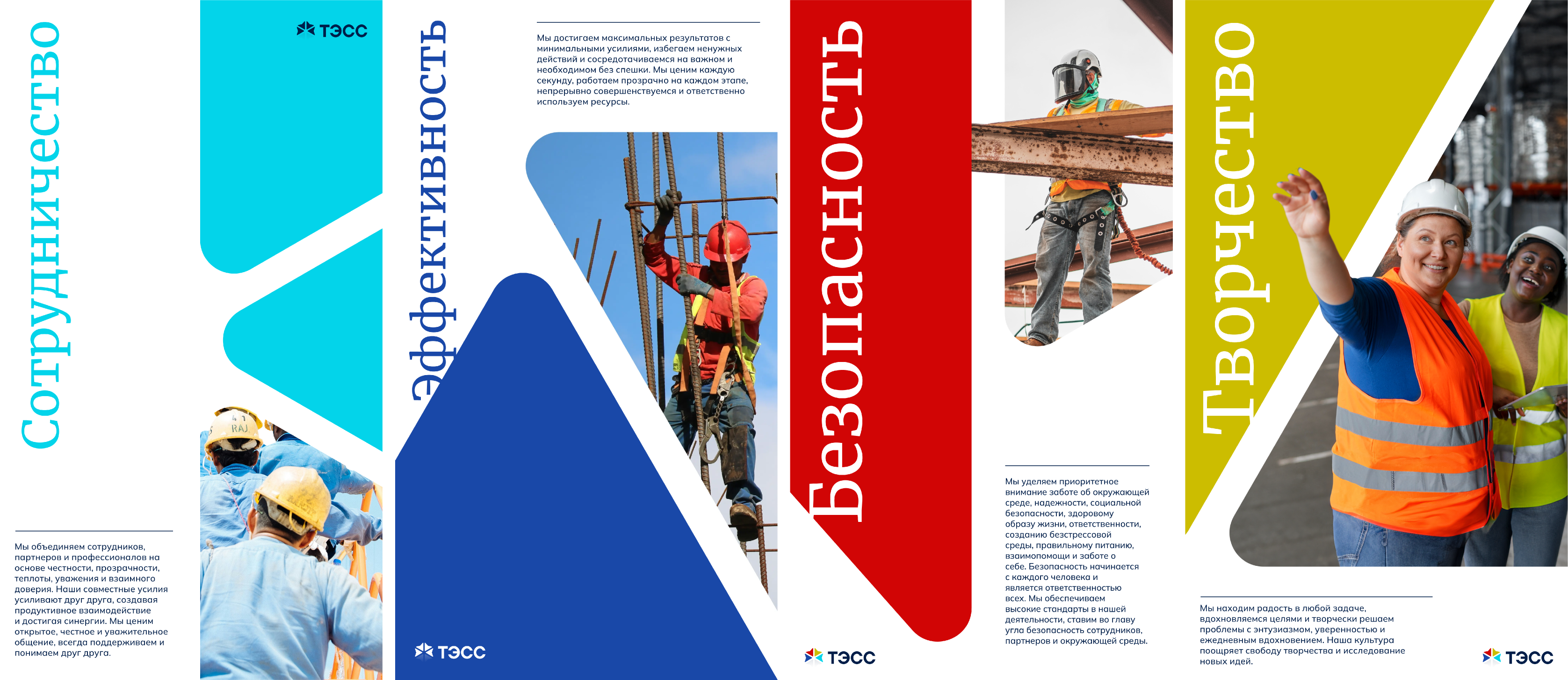
my role
In the project, I was responsible for all the design and art direction. From the briefing, Antonino and I started to rethink, he, the internal – with tone of voice, values, and tagline – and I, the brand's visual identity – based on their desires and wanted goals, creating a new logo, maintaining specific characteristics of the previous one, new font pairing, an expanded color palette, image usage system, system for replicating specific logos, brand graphics and lockups, all in two versions: Russian and English.